Not Just Websites
🎨 A Guide to Disability-Friendly Art and Design 🦯
Last Updated: 9/29/2024
If this page ever becomes inaccessible, you can always find the new link on my Patreon page for free here.
Did you know businesses can face a lawsuit if their website is not ADA compliant? But what about graphic design? What even does "ADA compliant" mean? So many questions!ADA Compliance refers to the standards set forth by the The Americans w/ Disabilities Act (ADA) in order to protect Americans with disabilities from discrimination and accessibility issues. If, for example, a restaurant's website is not ADA compliant via text that is too small, that means any disabled customers they have may not be able to access that service which is illegal.
Why Should I Make My Designs More Accessible?
The Americans w/ Disabilities Act (ADA) defines a disability as, "physical or mental impairment that substantially limits one or more major life activity." This means something as common as Dyslexia, ADHD, or even an addiction can be considered a disability. You're way more likely to meet a person with a disability than you are a person with green eyes (2% of the global population)! While graphic design is big on using images, we still use text in our designs for important info. Not to mention, images can easily become impossible for some to see. Even if you're not at much legal risk, you're still missing out on a significant chunk of customers/viewers by not trying to be more ADA compliant.
| Statistic | Source | Percentage (%) |
|---|---|---|
| Global Population Affected by Disability | WHO | 16 |
| Global Population of Gamers Affected by Disability | AbleGamers.org | 20-45 |
| Total USA Population Affected by Learning Disabilities | NCES | 32 |
| Global Population Affected by Dyslexia | Yale University | 20 |
Certain disabilities (eg. "invisible" disabilities that aren't obvious at first glance) are more common than statistics say as they tend to be the least commonly diagnosed and reported, so keep in mind all these numbers may be much larger than listed.
FONT
Fonts in the serif and sans serif are the safest option. If you must include cursive, fantasy, or monospace type of fonts, use with caution. Also, if it's a design people will only see online, you can include all text on the design in a caption so people's screen readers can detect it and read it for them. For printed designs, you could include an accessible version of the text somewhere else on the design.There are specific fonts made for dyslexic viewers like Dyslexie or OpenDyslexia.
Green (serif, serif sans) fonts below safe to use, the red (cursive, fantasy, monospace) fonts may be difficult to read but this can vary. (You may not be able to see these fonts on some devices).
Serif
Serif Sans
Cursive
Fantasy
Monospace
SIZE
Generally speaking, 12 should be a minimum for font size and is especially important for printed designs. For secondary fonts (ex. subtitles/headings), aim for half the size of your main font (usually the title, your largest text) and a third of the size for supporting text (captions, descriptions, etc.)
Title
Heading (1/2)
Body/Caption (1/3)
TOO SMALL (1/4)
Contrast
Contrast is the difference in shade and saturation between your background and foreground (ie. text, images, etc.)You can use the WebAIM Contrast Checker tool to make sure your contrast is good enough for important elements.
Good Contrast
Decent Contrast
Bad Contrast
Good Contrast
Decent Contrast
Bad Contrast
Good Contrast
Decent Contrast
Bad Contrast
Color
Color (color) is different from contrast.
Color blindness is not usually the total lack of ability to see color (black and white, ie. Monochromacy) but often only certain colors. When making a design, limit yourself to only 1-3 colors and supplement with the use of icons/pictures so that it is more accessible to these people. If you have a design that looks weird with just 1-3 colors, using art that has heavy outlines (lineart) helps. You can use this tool by David Math Logic and/or this by Colblindor to check for color blindness compliance.The following color combos can be a nightmare for color blind people if they are on the same image/object (ex. red foreground on green background):
1. Red and Green
2. Brown and Green
3. Purple and Blue
4. Blue and Green
5. Yellow (Yellow) and Light Green (Light Green)
6. Grey (Grey) and Blue
7. Grey (Grey) and Green
8. Black and GreenObviously, as an artist, you want to make sure the colors look good too. You can use Canva's color wheel here if you struggle with deciding combos (ex. blue compliments orange).
Spacing & Minor Formatting
If you have designs that require supporting text like descriptions, keep them as short as possible and use things like bullet points or numbered lists. You don't really need full sentences for things to get the point across either, you can even leave out words like are, is, and some pronouns (such as "I" in "I am").Lastly, make sure your margins, letter spacing, and line spacing are far enough that the text doesn't touch each other. Double-spaced type of line spacing is best so people don't accidentally skip sentences as much.
Yes! This is good line spacing.
No! This is bad line spacing.
Good character spacing.
Bad character spacing.
IMAGES/Art
Images and art are straight forward and should generally follow the same guidelines as text for contrast and size. But because we're talking about ✨design✨, let's talk about the best style of images to use:
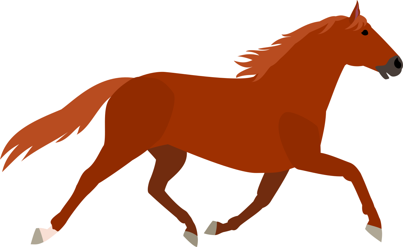
Flat (Clipart)
Sometimes has lineart but hardly any shading or highlights. These are great if you need simplicity. They're also easy to identify from a distance if a good size.

Silhouette
1 to 2 colors/shades (black or white) meant to imply a specific shape with the least amount of detail. Make sure the shape is easy to identify from a distance.

Cartoon
Often has lineart with highlights and/or shading. The most attractive but can be difficult to match to other elements depending on the style (unless you draw them all yourself).
Language Use
To conclude this guide, make sure you don't get too fancy with the vocabulary! While it's good to use words like "beautiful" to replace "very pretty" to save space, make sure they're common words that everyday people use (6th grade level English). Not only is it accessible for those with average vocabulary sets but it's also accessible to people who have memory-related disabilities or other language-related disabilities.Additionally, be careful of ableist language use. This can easily be accidental, for example, using the term "special needs" instead of "has accommodations". You can learn more about ableism here, what it is, and how to prevent accidental ableism.